I recently offered to review resumes or portfolios for up-and-coming UX grads, or those impacted by COVID (offer’s still open!).
Rather than explain my rationale for a recommendation in detail, I often include a link to an in-depth article – and I’ve found myself going back to the same ones over and over.
This is my curated list of relevant best practice articles, as well as how-to’s and examples.
Who?
However, let’s start where all UX things should start: who are your users?
You probably have two types: a recruiter and an UX lead.
At a very high level, this means you have someone who doesn’t know much about UX (most likely) but might be looking for certain keywords to make sure you’re worth talking to, and keeping an eye out more for things like ‘cultural fit’ and ‘articulate’ than focusing on technical details.
And you have someone who does know a lot about UX and is looking to see if you’re worth their time to interview. Unless you’re applying at a smaller company where you’ll be the first UX person – then it’s likely that no one looking at your resume and portfolio is an UX expert.
Keep in mind both the recruiter and UX lead are busy people, looking through a lot of resumes and portfolios. Information should be scannable.
Best practices to keep in mind

- https://medium.com/@cgbhatia/content-design-for-resumes-portfolios-personal-statements-f7957dc8c1b7
- Content design for resumes and portfolios
- Recommendations on sentence/paragraph lengths, consistent verb tenses, and the shape of a bulleted list (which I’d never thought about before!).
- Added June 9: https://marketingexamples.com/copywriting/tips
- Overall copywriting tips, if that’s not your strength.
- https://baymard.com/blog/line-length-readability
- Don’t make your line lengths too long! Or too short, but I am mostly seeing very long line lengths on both resumes and portfolios.
- http://www.zaetric.com/pdf/White%20Paper%20-%20Readability%20Legibility%20and%20Text%20Justification.pdf
- This explains why you should left-align your paragraphs. I’ve been seeing a lot of justified, which is harder to read.
- https://uxdesign.cc/dear-web-designer-let-s-stop-breaking-the-affordance-of-scrolling-fe8bf258df7b
- For portfolios – if you have to tell someone to scroll, you may be doing it wrong…
- I know this is super popular right now! I still don’t think it’s a good idea. That said, I think it’s merely annoying, not a big deal.
Resume how-to’s and examples

- https://enhancv.com/resume-examples/ux-designer/
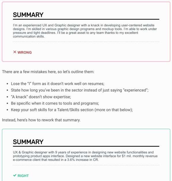
- Good ‘what to do’ vs ‘what not to do’ examples and recommendations here.
- https://blog.uxfol.io/ux-designer-resume/
- Breaks down the sections of UX resumes before diving into some examples.
- Includes a list of common mistakes (though I disagree that more than one page is a problem, particularly for someone with many years of experience).
- Also includes links to resume templates.
- The article kind of repeats itself towards the bottom, which is weird, but it’s still a good article overall.
- https://www.themuse.com/advice/every-basic-question-you-have-about-your-resume-skills-section-answered
- I’ve noticed a lack of a robust ‘skills’ section on resumes. This article outlines two very good reasons why you should have them – making it easier on the recruiter to confirm you’re qualified, and so you can get through the ‘bots (ATS) that might block you.
- It also gives some examples of how to list out hard and soft skills.
- Examples: https://www.casestudy.club/journal/ux-designer-resume
- Note that most are two column – I’ve gotten several single-column resumes (see note above about line lengths…)
- More examples: https://medium.com/bestfolios/8-brilliant-ux-designer-resumes-that-secured-job-offers-from-google-c9e534adafc2
- Added April 27: https://uxdesign.cc/how-to-design-your-resumes-3b86ff7d9f76
- As #3 here indicates, be careful to make your resume ATS-friendly! ATS (Applicant Tracking System) can’t read fancy fonts and don’t handle images well.
- This is particularly applicable if you’re applying to a larger (Fortune 500) company. ATS may or may not be used in smaller companies.
- Learn more about making an ATS-friendly resume here: https://www.glassdoor.com/blog/ats-friendly-resume/ and https://www.hloom.com/resumes/ats-resume-templates/
- Added June 9: If you want to see how your resume is read by ATS systems, you can get a free scan here: https://resumeworded.com/resume-scanner
Portfolio how-to’s and examples

- https://docs.google.com/presentation/d/1mmLw8VQGjP35yhAVoJMN7GHDqyQTUz_XCx6zZe9IJo8/edit#slide=id.g57aaf0ff24_0_1397
- Lisa Fischer put together a really comprehensive guide on portfolios – check this out!
- Includes some great examples and explanations.
- https://careerfoundry.com/en/blog/ux-design/how-to-create-a-killer-portfolio-expert-advice-from-a-seasoned-ux-designer/
- In addition to good UX-specific advice, this article covers how to grow your portfolio and how to make it stand out.
- Also includes a list of what not to do.
- Examples: https://uxdesign.cc/50-essential-ux-portfolios-2019-edition-38d87fccd998
- Here’s 50 curated examples!
- I admit that I didn’t look at all of them, but the ones I did seemed good (other than a few dead links)
Language
Especially if English isn’t your first language, please get a friend to review the language of your resume and portfolio in detail. Grammatical errors and misspellings look unprofessional.
(added June 9) Check out grammarly as well to help avoid mistakes.
Resume – one vs two
There’s a lot of debate about one vs two pages (or more) for a resume. If you’re straight out of school, one page should probably be enough. But if you have more experience, I think it’s fine if people go onto a second page. Better to have good readability and two pages than to use tiny font and only have one page. That said, plenty of people out there disagree with me, and I’m not an expert.
My guess is that the ‘one page only’ rule came from when resumes were hard copies. Even if you do go to two pages, it’s still important to be concise and make your resume easy to skim. And if you have a second page, be aware that the recruiter might not read it.
Document your work
Also, this is a good thing to consider – document your UX work over time, not just when you lose your job or are thinking about switching: https://www.invisionapp.com/inside-design/document-your-ux-work/
Good luck out there! Reach out if you have any questions or feedback.
Jackie, nice work. In addition to a target company’s ATS, you will also be posting your resume to places like LinkedIn or Indeed. So all the more reason to avoid fancy graphics and images that won’t work on those types of sites.